This project was first discussed with the client a little more than a year before we re-connected to start work on it. I had been working in New York City and met Claudette who told me her business plans. She was ready to expand her house cleaning business, Complete Maids and Cleaning Services (CMCS). We continued to discuss creating a website for her business sometime after I returned home from New York.
Complete Maids and Cleaning Services (CMCS) had a broad scope of work that needed to be done and is one of the larger projects I’ve worked on up to this point. As a result, there were many challenges to overcome throughout the development process. Some higher-level line items that found their way to the todo list are:
- Assess needs based communications with the client, research competitors.
- Create a style guide and branding.
- Design and develop a custom WordPress theme.
- Set up web hosting environment in compliance with the PCI DSS — Payment Card Industry Data Security Standard.
- Finding or Creating an appointment plugin for WordPress.
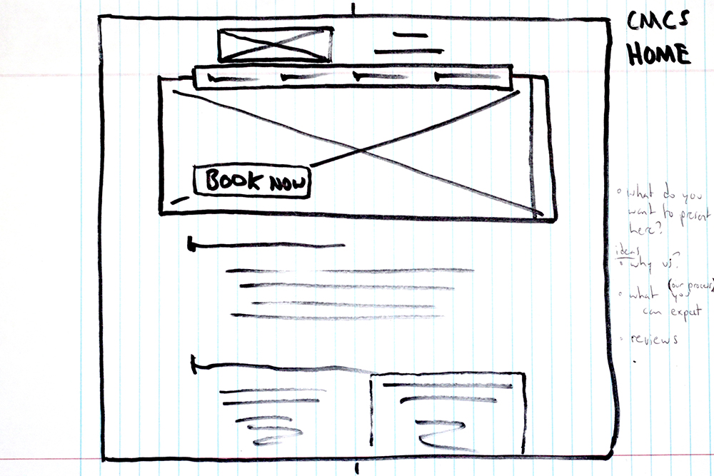
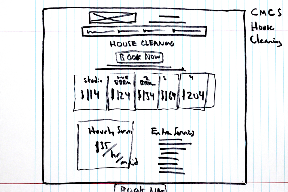
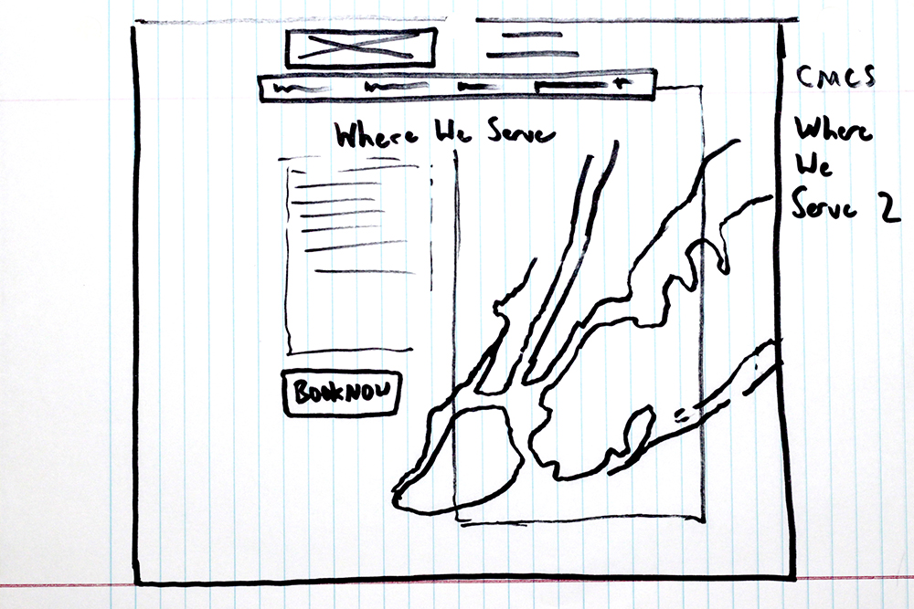
Everything starts with a little communication, after initially meeting and learning about the plans for CMCS we continued to communicate through phone calls and email. Emailing wireframe sketches and branding ideas, ultimately, we set up a hosted development platform that helped demonstrate design concepts and serve as a test environment for new solutions. Phone calls allowed for speedy reference to demos and images to simplify critique and ease discussion throughout the design and development process enabling CMCS to directly impact the look and functionality, contributing to what would become their brand and web presence.
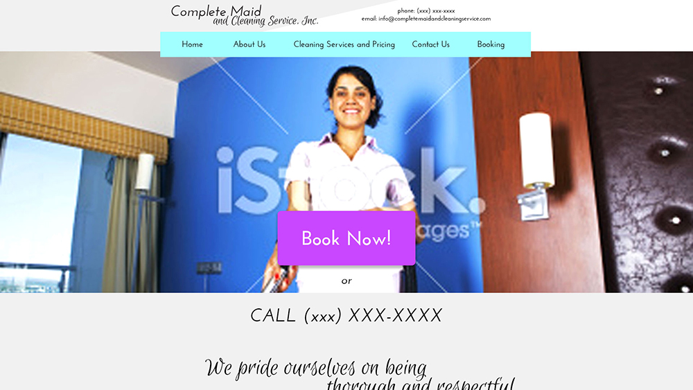
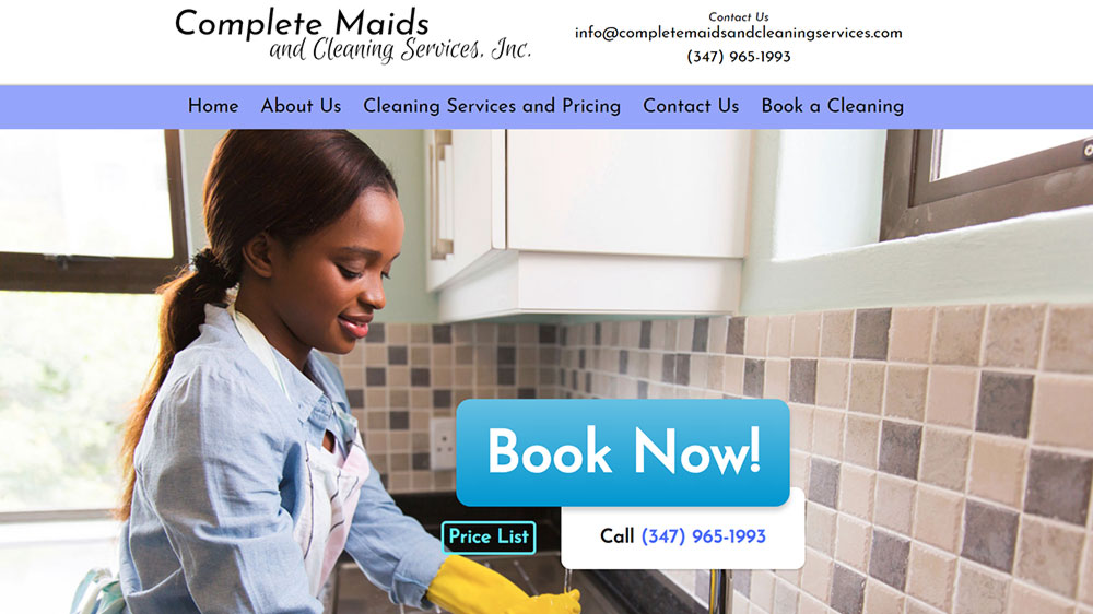
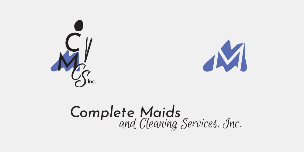
The first portion of the project was more that of branding and identity. I did a bit of research looking at the local cleaning businesses, their pricing, how they present themselves through branding. Working with Claudette, I designed a logo that illustrates her cleaning business, and a word-mark that can stand alone or with the logo in an emblematic, clean style. Complete Maids is in a font that is clean and embellished while and Cleaning Services, Inc. is in a script font that emulates dusty clouds. Part of the branding effort involved creating a style guide to discuss intent and interpret the tastes of the client for design direction. This helped to streamline the web design process and ensure consistency.
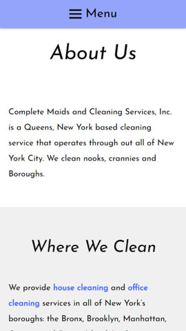
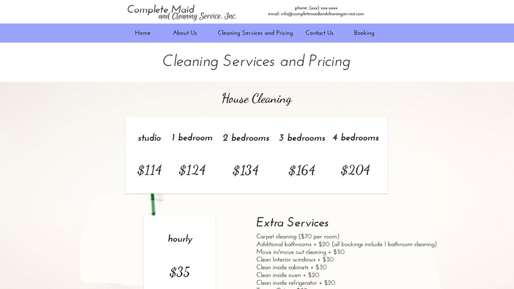
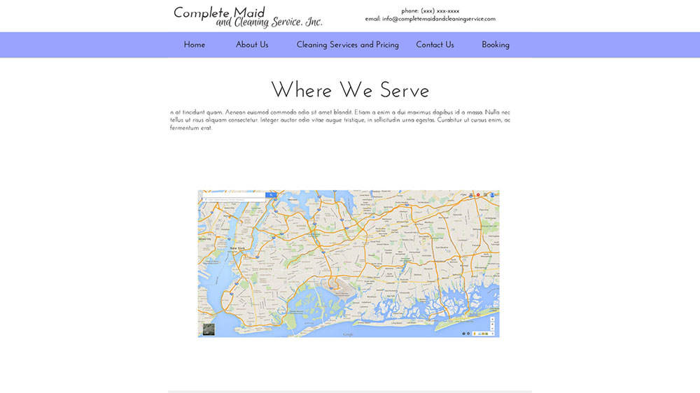
Next, began the push to complete the web site. We set up hosting with Bluehost. I created a SQL database and installed WordPress. We used the latest release of the official WordPress theme as a framework for designing the website; rewriting much of the theme’s files to achieve a modern, responsive design using the styling we defined in the style guide. I created a plugin that adds shortcodes for buttons, contact information, and other repeated components to make updating easier.
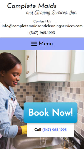
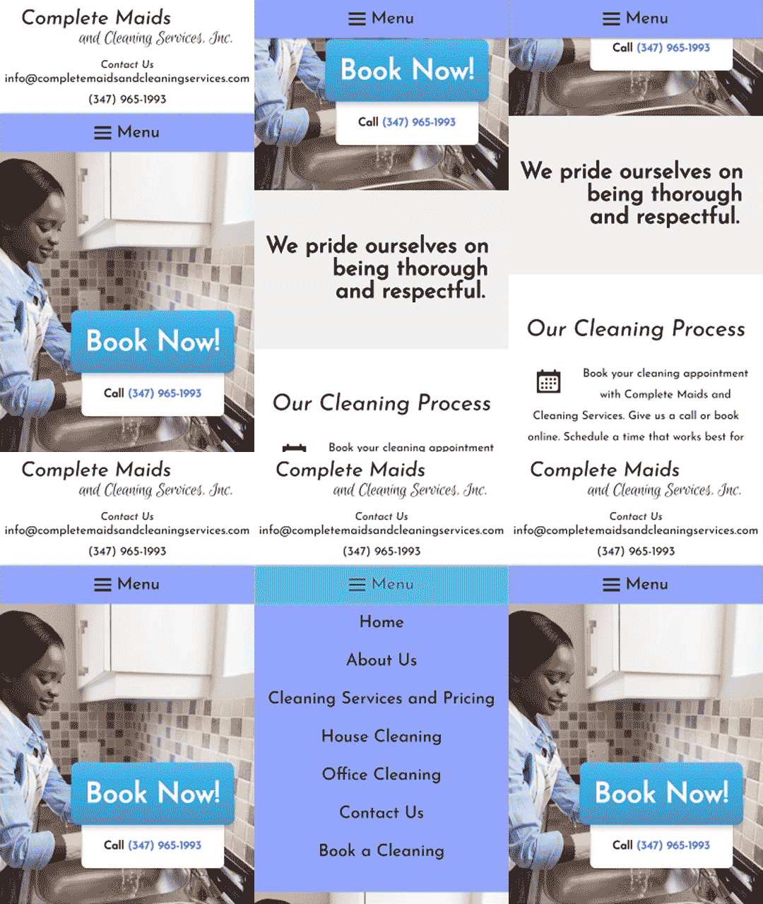
When designing websites and applications it is typically best practice to design the mobile view and scale it up for tablets and desktops unless there is a good reason to do otherwise. This was the plan for our process designing and developing components and sections for CMCS. We made every page element responsive by making the specific elements arrange themselves in an intelligible, implementing best practices and introducing new styling rules to adjust elements. This was all accomplished using an iterative process of testing a variety of screen sizes and breakpoints and making the necessary adjustments.
Communicating with Bluehost support through the whole process was very helpful in assisting us to meet the requirements set by Payment Card Industry Data Security Standard PCI DSS) for handling and processing Credit Cards. Some of this process required consultation of a third party, Security Metrics, to audit for PCI DSS compliance and to inform of any shortfalls in hosting setup or website. I learned a lot through this process, security is always a focus when developing, but I had not implemented Payment Card Industry standards before.
When we started to run out of details to polish, getting nit-picky with the design of the website and the theme was looking good, we started to experiment and tinker in search of an appointment plugin. Ultimately, we chose BirchPress, a WordPress plugin that empowers visitors to schedule appointments through the website. We picked BirchPress because it was reflective CMCS’s business model and allowed CMCS to book and manage appointments in a manner relating to their business needs. It had a clean modern look, seemed to be well documented with the availability of hooks to adjust output, and there was an active support community that might help with any problems we run into.
After installing and setting up BirchPress it was time to use a few hooks to adjust a few actions in how BirchPress would normally respond. This was easier said than done, as it turned out many of the hooks were not documented. Luckily, I found someone who had gone through a similar process and shared their story saving me some headaches.
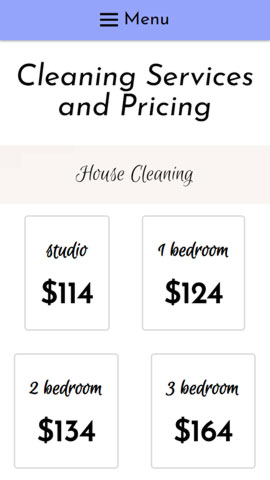
As I was beginning to figure out how to work with and customize BirchPress, the project was transitioning into what would be the final stage, and the development heavy stage of the project. It involved extending BirchPress appointment form to add pricing options that are adjustable depending on the services the user requests.
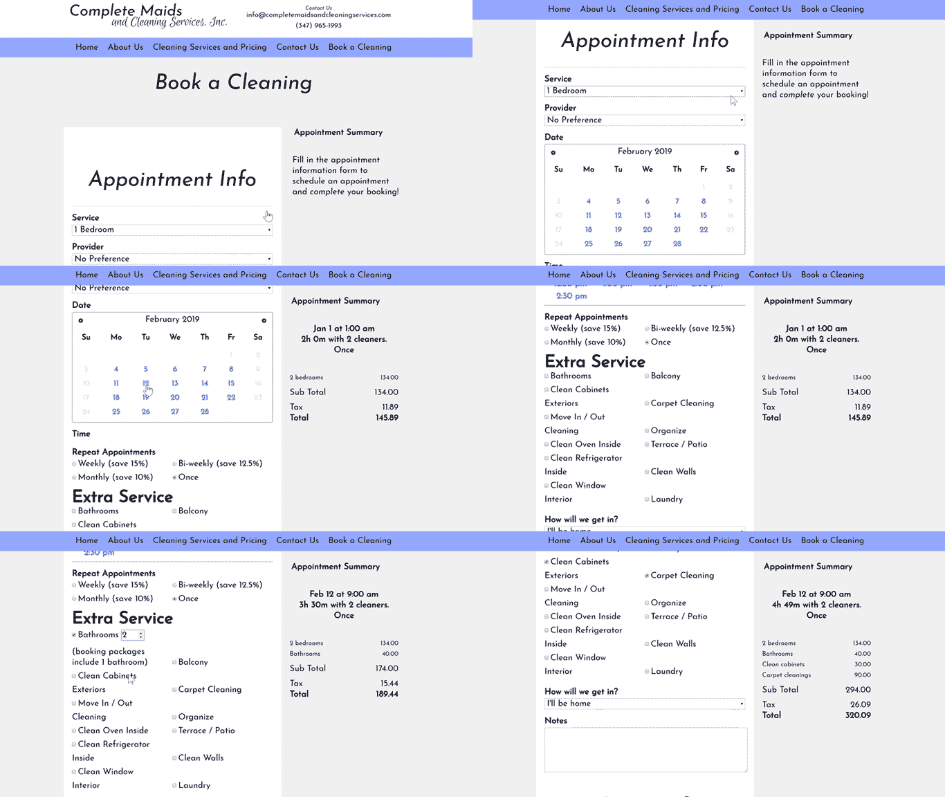
In addition to the client side booking and payment form, we developed a toolset for cleaners and managers to manage their hours, appointment schedules, and payment methods.
This was all accomplished while being aware and managing which customer information is processed by which entities to ensure the proper separation of services for PCI DSS compliance while still retaining acceptable information appropriate for conducting business. We used Braintree to manage and handle payment processing. Braintree is a PayPal service, at the time there was not an easy way to manage some of the payment options we wanted to implement with PayPal alone.
Some of these challenges slowed development down considerably. However, by being in close communication with CMCS it wasn’t a surprise that the project was running behind schedule. caused by some of the unforeseen complexities required to achieve PCI DSS compliance, and the less than perfect documentation of the BirchPress plugin we extended.
We staged a soft launch and designed flyers that CMCS was able to share with its customers. The website was fully completed, and the appointment booking form and payment form fully functional a month later.
Hindsight is 20/20. If we were to do this project over again I would have broken the development process into smaller steps, adding user tests to gather analytic data in order to determine the engagement levels on the website. Though we determined CMCS desired an online booking form, money could have been saved in realizing that a booking form was not necessarily what their customers wanted.

